
Many people tend to underestimate the power of color in their product design and branding, but it can have a much larger effect than most people realize.
According to a large survey conducted by Xerox Corporation, 90% of their customers feel that color attracts new customers, 81% believe that their brand colors give them a competitive edge, and 83% feel that their color choices make them appear more successful.
Color is a bit of a double-edged sword because it has the power to make or break your brand, but brand color psychology is often an element that is underestimated when rebranding or launching new products. Why does it matter so much?
Certainly, color preferences are a matter of opinion on an individual level, however, multiple studies over varied sample sizes, countries, and demographics have shown some generalized trends that have stayed relatively consistent over the past 50 years or so.
There is an element of scientific explanation to some of these generalized trends as well, all of which will be broken down in this article.
Why is Color Important to Brands?
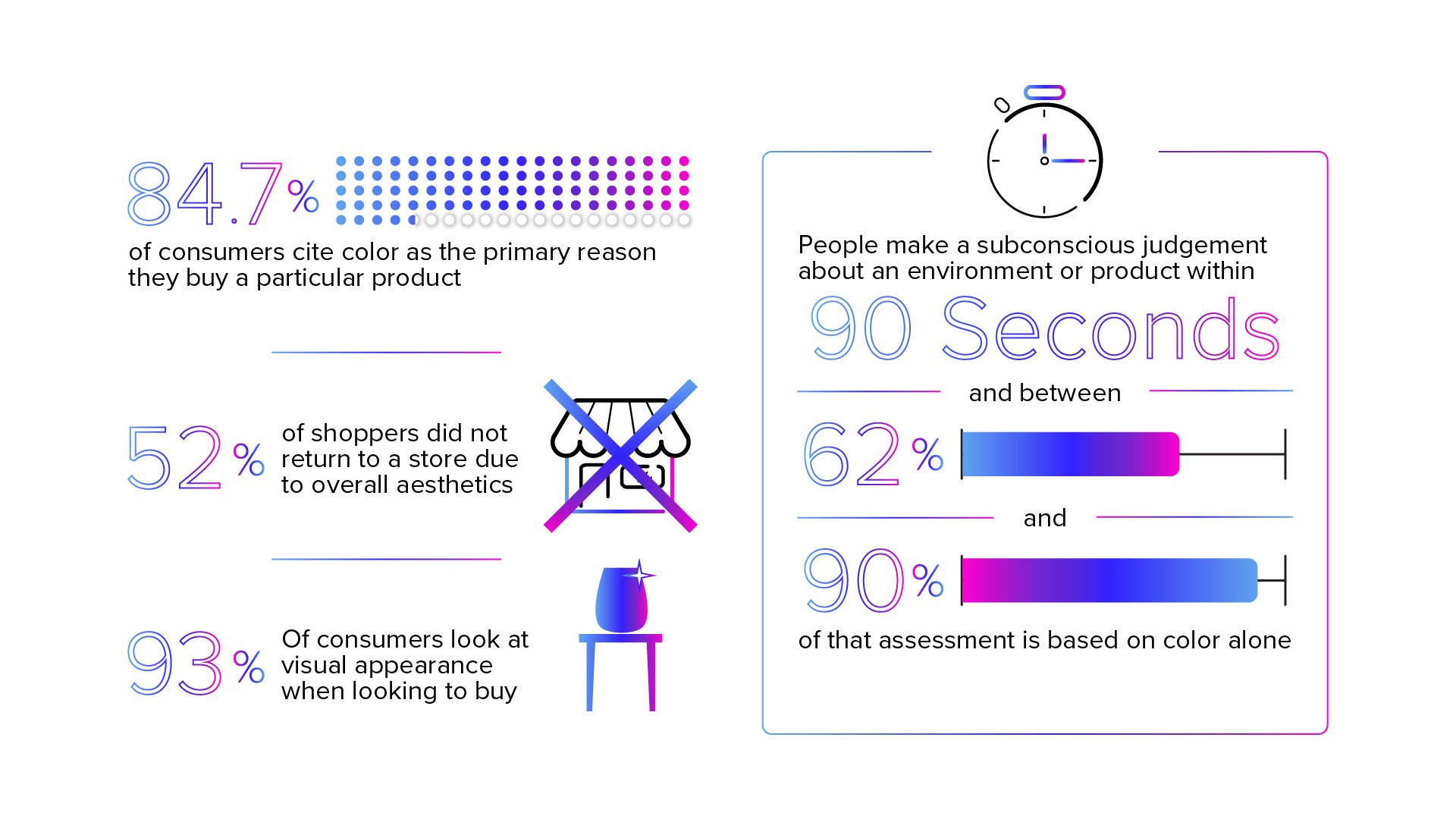
There are a multitude of reasons color is important to brands. In fact, a study found that color improves brand recognition by up to 80%. And that’s not all. Take a look at some statistics about how color can have an impact on your business.
- 7% of consumers cite color as the primary reason they buy a particular product.
- When looking to buy, 93% look at visual appearance.
- 52% of shoppers did not return to a store due to overall aesthetics.
- People make a subconscious judgement about an environment or product within 90 seconds of initial viewing. Between 62% and 90% of that assessment is based on color alone.
Colors also help build your brand identity and bring consistency across your business from logos, to product packaging, website design, and advertisements.
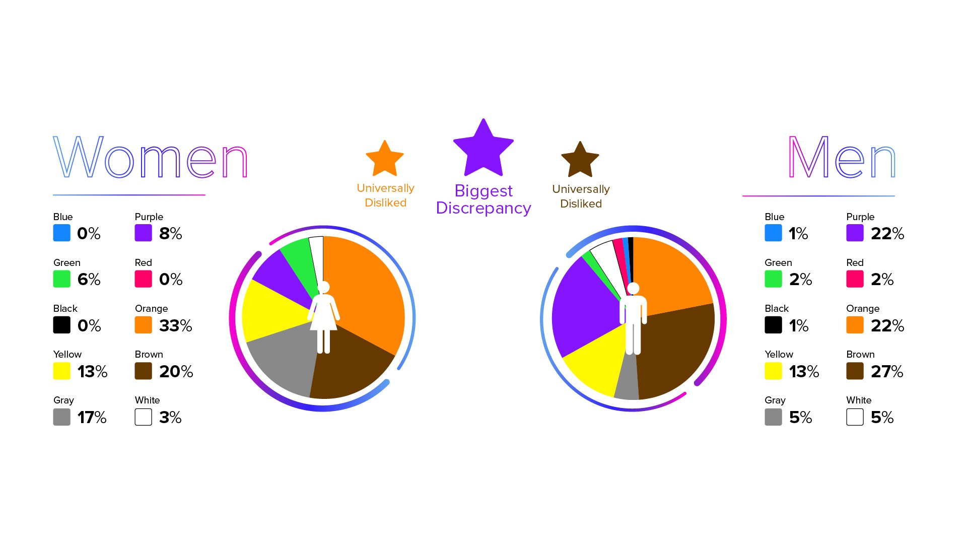
Favorite Colors: Men vs. Women
While favorite colors are subjective to each individual person, research supports that men and women favor certain colors. Universally, studies show that blue is both men and women’s primary preferred color. One study dove into why blue is so popular and found that it’s associated with clean water, clear skies, authority, truth and tranquility.
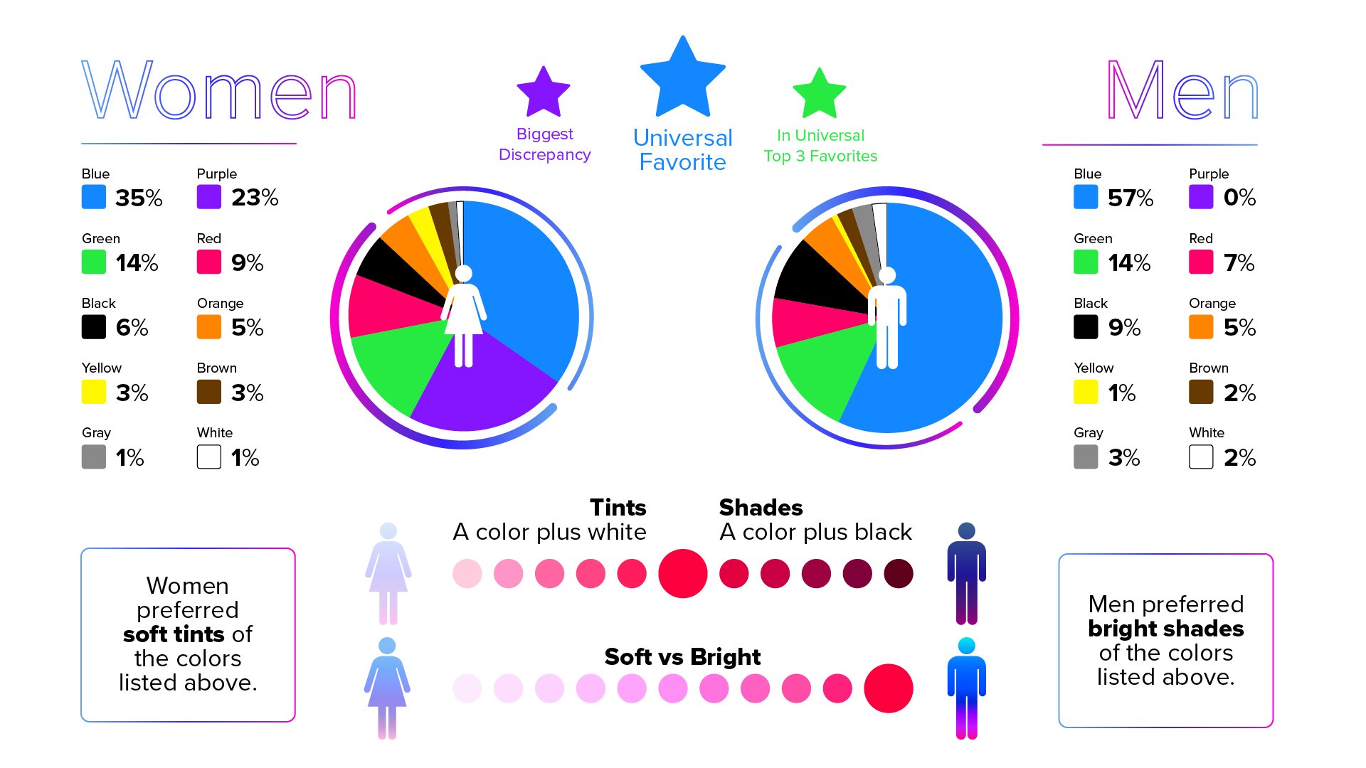
Both men and women also like green and red as top favorite colors. Purple is an interesting color because it lands in both the favorite and least favorite category for men and women. However, there are significantly more women who prefer the color purple over those who dislike it.
Where’s pink on these lists, you may ask? Pink is considered a tint of red and is included in the “red” portion of the results.
In the study mentioned above, the results showed that women heavily prefer soft tints of colors (such as pink) whereas men prefer bright shades (such as ruby red). A tint is any color plus white, whereas a shade is any color plus black. So although red is shown as a favorite color for both men and women, the subsets of reds they like are very different.
We evaluated 4 different studies conducted at different times, with different samples sizes, in different countries, and they all showed the same general preference results among men and women.
Why is that? There is no definitive answer to this question, but some scientists suggest that the answer may lie in our genetics. According to an article by Genetic Engineering & Biotechnology News, women can see considerably more differentiations in colors than men.
Color vision depends on color cones in our eyes, which are carried on the X-chromosome. Men only inherit one X-chromosome instead of two, as women do. These cones tell our brains what color we are experiencing by interpreting wavelengths of light.
Because men don’t inherit the same combinations of cones women do, men’s brains often require slightly longer wavelengths of light to experience the same colors. The article suggests this may be why men prefer colors with short wavelengths, like darker shades of blue and green, or they prefer shades without any wavelengths at all, like white, black, and gray.
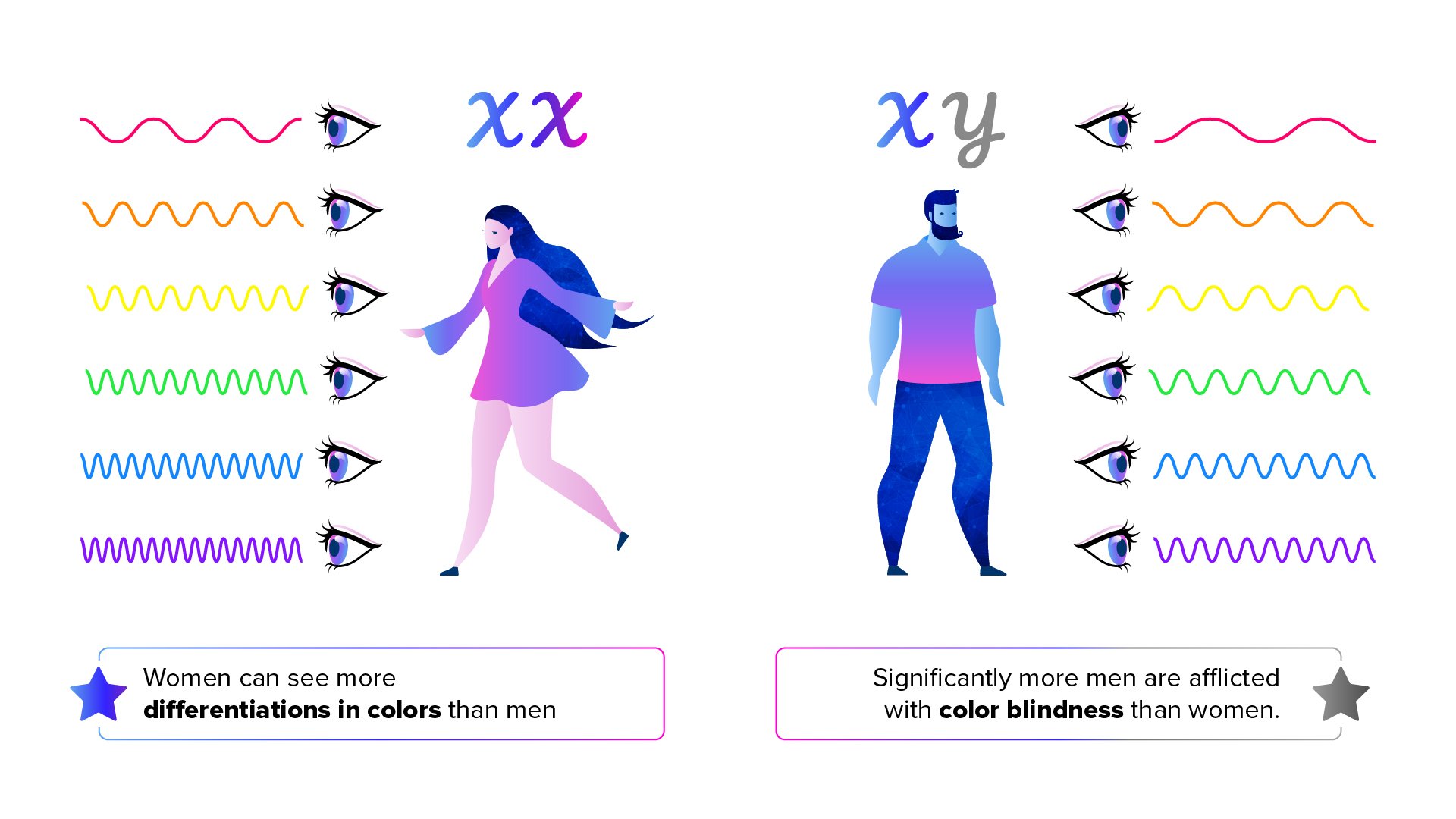
The way we inherit our color vision is also a major contributor to color blindness. Significantly more men are afflicted with color blindness, which may skew their color preference results. According to the Howard Hughes Medical Institute, 7% of men are color blind, compared with only 0.4% of women.
Least Favorite Colors: Men vs. Women
Just like favorite colors, men and women have the similar distaste for certain hues. Regardless of gender, brown, orange, and yellow are at the top of people’s least favorite colors.
Of course, there are no rules when it comes to deciding on brand colors. While statistically yellow falls into the “least favorite” category, many brands have adopted yellow as one of their main colors – McDonald’s, Ikea, Sprint, Subway, Best Buy, just to name a few.
In one survey, 26% of participants said they considered orange to be a “cheap” color. Does that stop brands from using it? No. Amazon, Harley Davidson, The Home Depot, 76, and Gatorade all incorporate orange as a major brand element.
While your brand can still be successful outside of traditionally liked colors, it’s important to consider your target audience when deciding your color palette.
Often times, people get caught in the trap of making color choices for their brand or product that they personally prefer instead of considering their target market. It’s important to remember that the main goal of a business is to make money, and that won’t easily be done if your target market doesn’t find your product or brand appealing.
Imagine what would happen if kids toys were suddenly all black, white, gray, and brown. Would kids still want to play with those toys? The entire toy aisle would completely lose its sense of wonder. On the flip side, most adults wouldn’t suddenly want all of their furniture to exclusively take on the colors of kids toys.
Identifying your target market and appealing to them is important to your brand’s success.
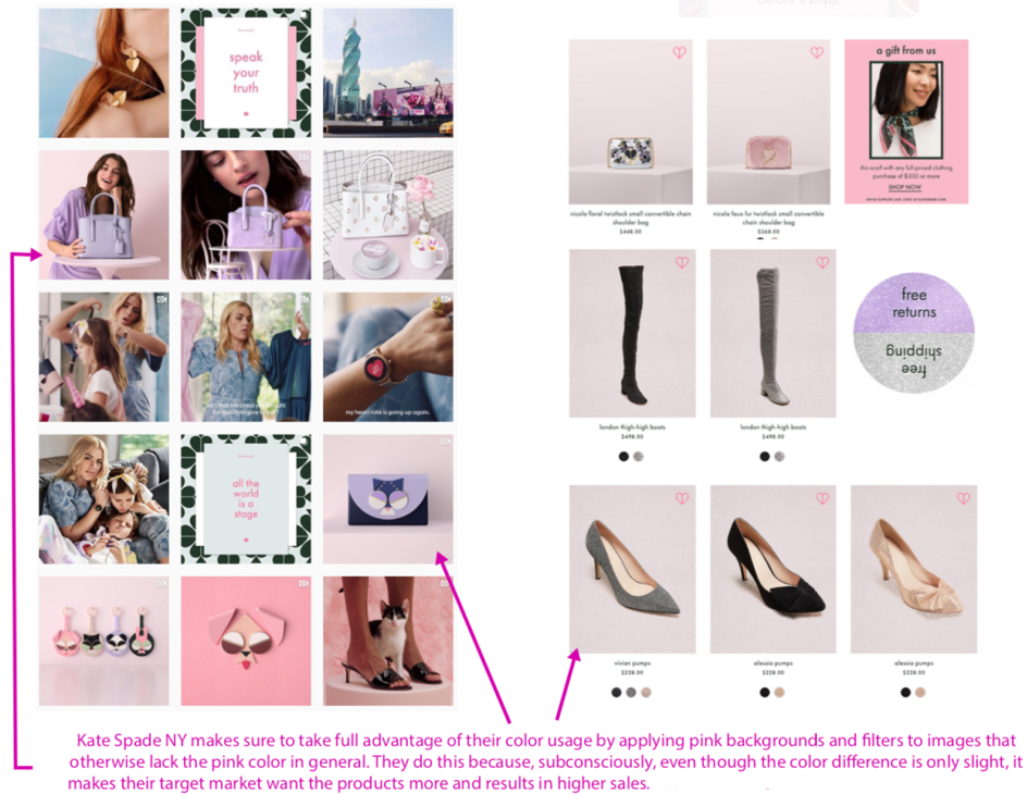
Brand Color Case Study: Kate Spade New York
![]()
Kate Spade NY targets women from 20 - 40 years old. Their brand image embraces traditional elements of femininity, while also being fun, cool, and empowering.
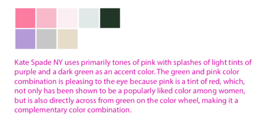
In today's social climate, things that are traditionally considered feminine, such as the color pink and lace, can be viewed negatively due to larger social issues.
However, Kate Spade NY makes a point of actively fighting these negative associations of femininity and encourages women to use these things to make themselves feel confident and empowered instead.
This has proven to be an extremely successful marketing strategy and has a positive social impact. When targeting women, it’s important to speak to their interests, be genuine in your message, and flip negativity on its head.
Using pink as a major brand element may not appeal to every individual woman. However, previous research along with Kate Spade NY’s success, suggests that it’s an effective strategic color choice that has proven to increase sales among the general female demographic.
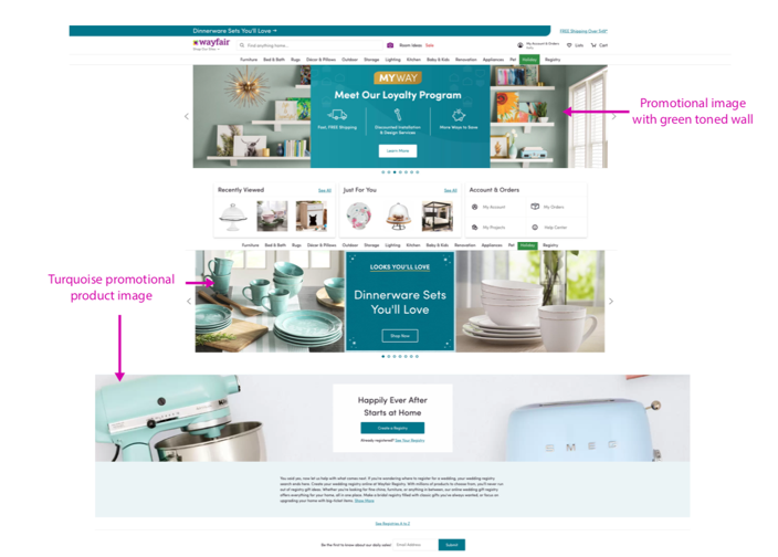
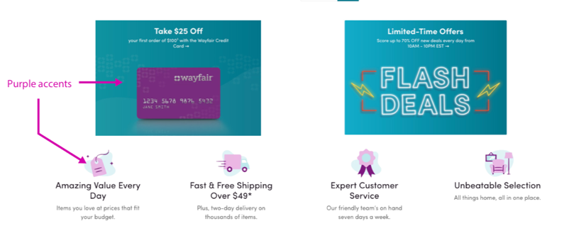
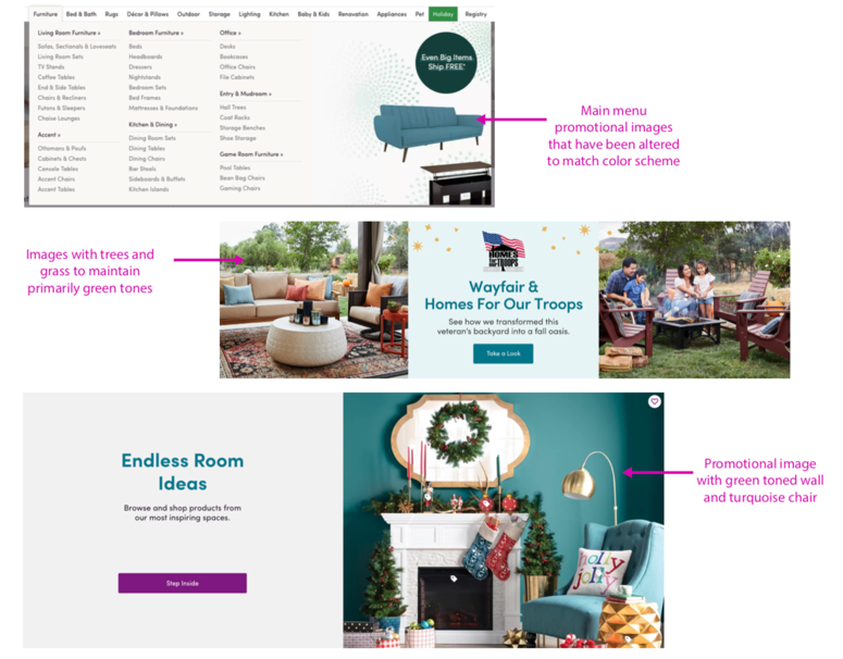
Brand Color Case Study: Wayfair
![]()
Wayfair is a home decor and lifestyle company that exists entirely online. It targets both men and women of all ages, however, they primarily target women 40 - 60 years old due to their significantly higher volume of female shoppers.
Wayfair utilizes a very consistent combination of purple and turquoise tones in both their website design and photography. This current brand identity, which was overhauled in 2011, has contributed to exponential revenue growth over the next seven years.
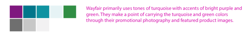
According to research, purple and turquoise are generally liked among most women. Turquoise is a combination of both blue and green, which are in the top 3 colors for women across multiple studies. Turquoise and purple are also across from each other on the color wheel, making them complementary colors, which creates a very pleasing palette.
Wayfair takes every opportunity it can to utilize color psychology. They even go out of their way to showcase products that align with their palette. This has been a very effective strategy for them and their revenues continue to increase.
Brand Color Case Study: Old Spice
![]()
Old Spice is a toiletries company targeted to men between 18 - 40 years old. They are best known for their cheeky advertising campaigns and eccentric sense of humor.
Old Spice primarily uses deep shades of red to appeal to its target audience, and mainly sticks to achromatic colors, like white and black, as its supporting palette. Sometimes, they use pops of blue as an accent color or to set the mood of their photography.
According to the results of the studies we analyzed earlier in this article, deep shades and bright reds perform relatively well for men, making its way as the 3rd most popular favorite color among men.
Old Spice is very strict about their color cohesion when it comes to their website design. At first glance, you see their trademark red colors and very well executed whitespace.
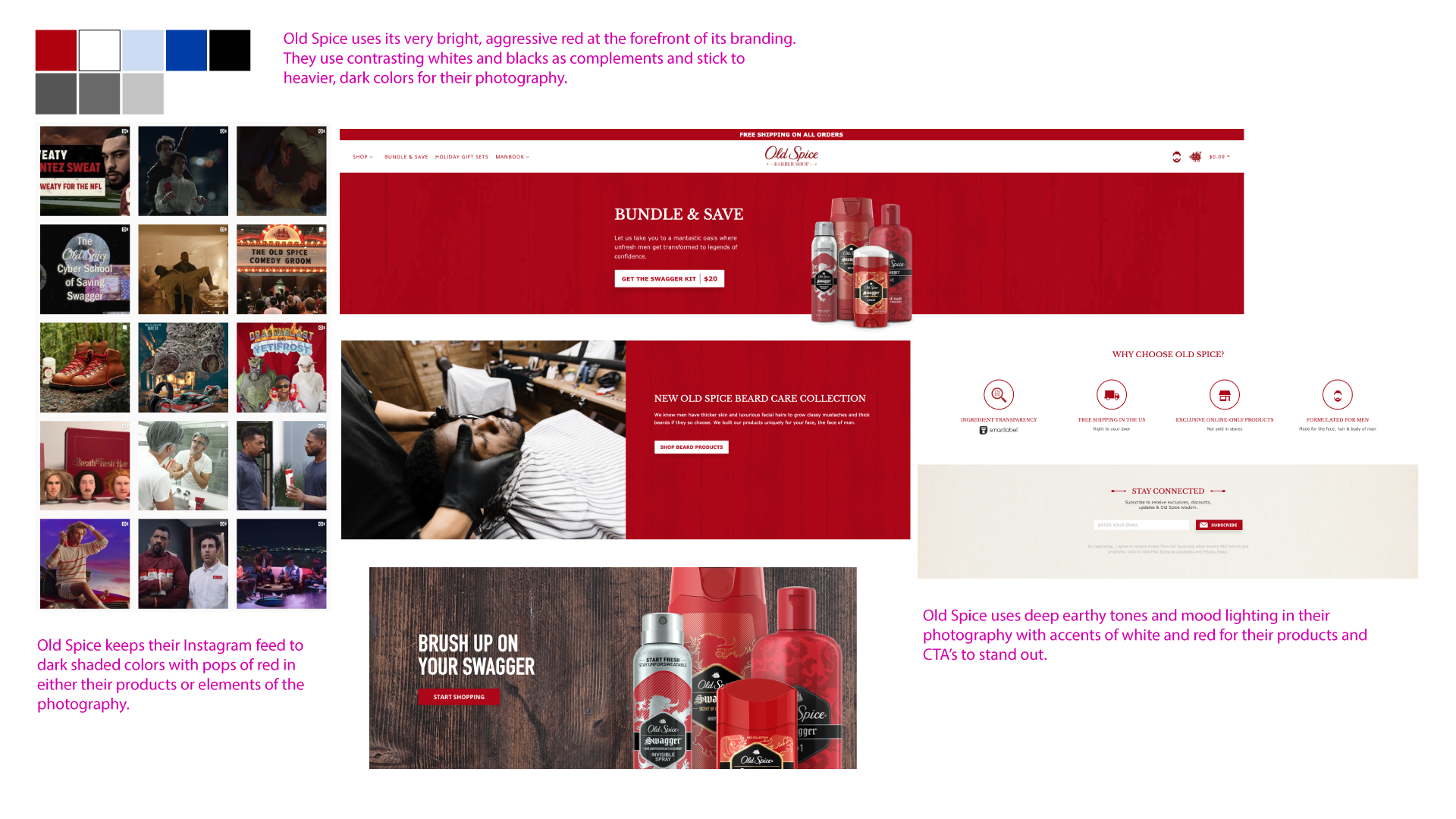
When used in packaging, the vibrant red of Old Spice products stands out among all the other products on the shelf, often resulting in higher sales because people are more likely to grab it.
Brand Color Case Study: Men’s Warehouse

Men’s Wearhouse is a men’s formalwear company that specializes in special occasion, business, and wedding attire. It targets men from 25 - 55 years old.
Men’s Wearhouse puts a great deal of effort into its branding, making sure to maintain its image of confidence and refined sophistication. Their main brand color is deep blue. They use achromatic colors such as gray, white, and black, to help their blue stand out.
Blue is the #1 preferred color among both men and women. Men’s Wearhouse chose a deep shade of blue that is very often used in suit and formalwear designs for men. Men’s Wearhouse makes sure to incorporate its blue and gray colors into most of its photography. If the product in a shot isn’t blue, they will often include a blue building in the background, a blue accessory, or add a blue filter over a photo.
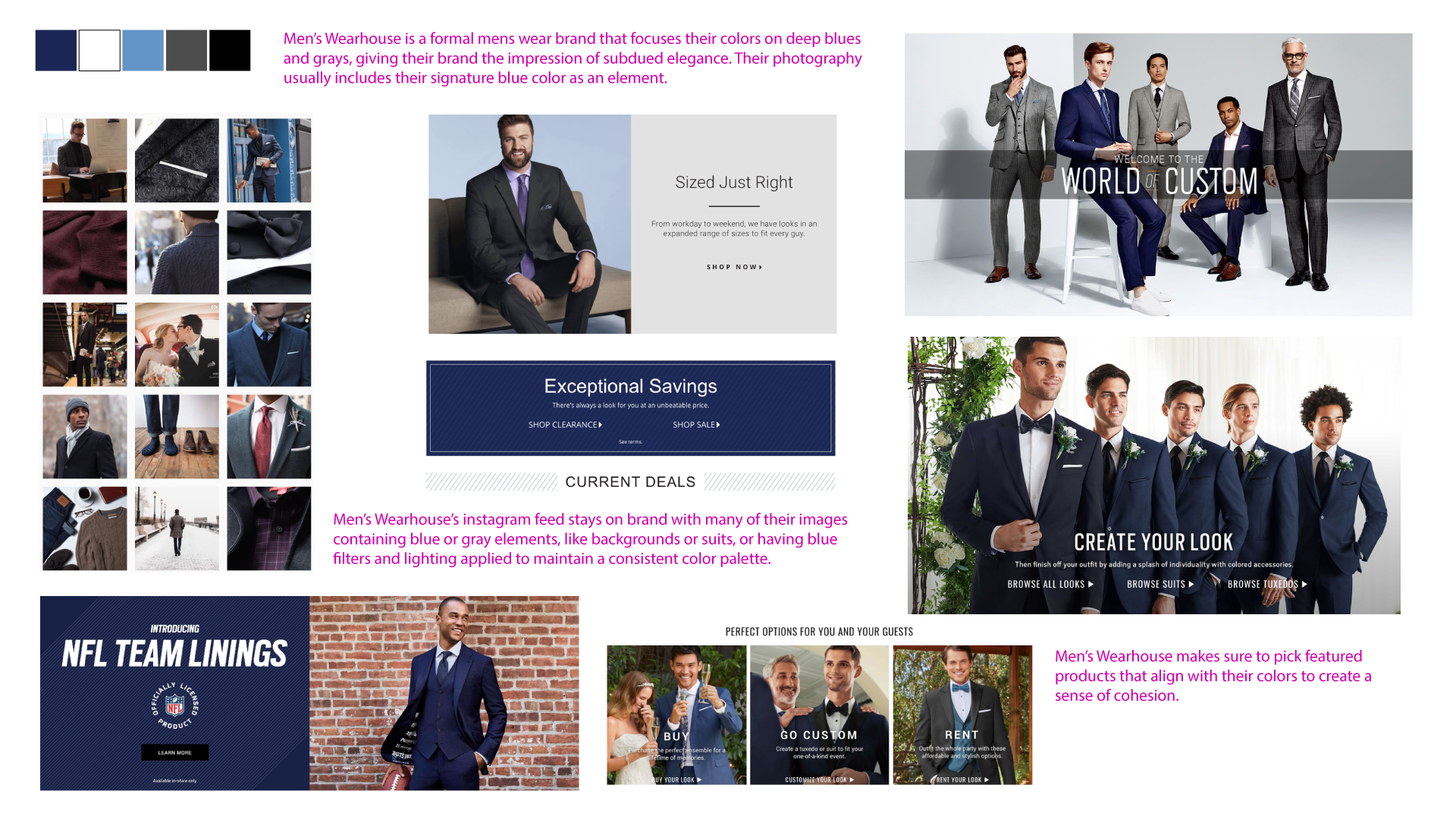
Their website UI takes full advantage of their color palette to create a very clean, easy to digest design that’s just as elegant and confident as the suits they sell. They utilize expansive white space along with a cohesive usage of their signature blue color to create a very straight forward design that appeals to men everywhere.
Picking Your Brand Colors
Color can have a substantial impact in how we view and react to a certain brand. While your brand color may not necessarily make or break your business, a solid first impression can go a long way.
When deciding your brand’s visual identity, remember to identify your target audience so you can shape and mold your product and services accordingly.
Get started on building (or redesigning) your brand with a free downloadable worksheet