There are some things in life that you can do on the fly, without much planning, like queuing up a movie on Disney+ to watch with your family or going on an afternoon walk with your dog.
Animation and video are not those things.
An animated video requires extensive planning that includes creating mood boards, style frames, and storyboards.
Now you, like many others, might be wondering, what are mood boards, style frames, and storyboards – and why are they necessary?
Here at VMG Studios, a creative marketing and branding agency that specializes in video and animation, we’ve had years of experience figuring out the best process for taking a project from its ideation phase into development and eventually deployment.
This article will break down the definition of mood boards, style frames, and storyboards and highlight how they build upon one another to help bring an animated video to life.
How is an Animated Video (Animation) Made?
Creating an animated video is a lengthy process and a big chunk of time is spent in the planning stages which includes creating mood boards, style frames, and storyboards.
In general, a two-minute-long animated video takes about 6 to 8 weeks to complete.
The process is broken up into 5 segments:
- Creative development and strategy
- Scripting, mood boards, and style frames
- Storyboarding
- Animating
-
Voice-over and sound design
FREE DOWNLOAD: Animation Process One-Sheet
As you can see, 3 of the 5 phases are dedicated to pre-production. It’s important to have a clear vision of the messaging, story, and style to ensure the project is smoothly executed in the animation phase. This is where mood boards, style frames, and storyboards come into play.
What Are Mood Boards?
Whenever I hear the phrase “mood boards,” I immediately think of mood rings, which I was obsessed with as a kid (anybody else? No, just me? All right).
Obviously, mood boards are not the same thing as a mood ring, but there are some similarities. Mood rings associate feelings with colors, such as a blue hue means you’re feeling calm and neutral while a black mood ring symbolizes feelings of fear or stress.
Similarly, mood boards are put together towards the beginning of an animation project to help outline the mood or feeling of the animation: colors to use, character styles, atmosphere, energy, etc.
Basically, what mood do you want your audience to feel when they watch the video? Energetic? Happy? Calm? Nostalgic? Serene? Scared? Sophisticated? You get the idea.
You can also think of mood boards as inspiration boards.
Here at VMG Studios, our creative team pulls inspiration from all sorts of places, such as other animations, movies, books, or magazines.
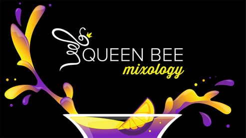
Our senior designer, Fenny, created this mood board for a rebrand of our internal mixology channel, Queen Bee Mixology.
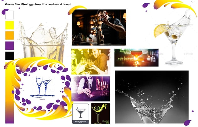
For this new Queen Bee Mixology branding project, we wanted to pull together a look that was fun, colorful, sophisticated, but also approachable. We gathered aesthetic assets, emotions, moments, and colors that we wanted viewers to relate to when watching a video.
This led to the final design for the closing and opening video title card:
If you’re still trying to wrap your head around what a mood board is, take a look at Pinterest. Pinterest is ultimately a giant mood board. In fact, users can create specific “boards” in which they add “pins” to.
Home content is one of the most popular categories on Pinterest where people draw inspiration for their favorite home décor looks. Other popular categories include food, fashion, and weddings. You can see how these “boards” can serve as a starting point for planning the perfect wedding or a remodel of your living room.

Creating mood boards for an animation project is part of the discovery phase in which the creative team will not only try to nail down the look and feel of the animation but will also research stylistic trends that fit within the client’s brand.
In general, VMG Studios will send one mood board to a client for their review, or a mood board (inspiration page) will be attached to a style frame design, which brings us to…
What Are Style Frames?
After the mood board stage, it’s time to move into style frames, which essentially are a more built-out version of mood boards. Mood boards generally just scratch the surface of what your animation is going to look like while style frames are where you actually start designing your animation elements.
At VMG Studios, we typically deliver two unique style frame designs to a client based on feedback from the mood boards. Depending on the budget, we can include fewer or more style frame designs.
Style frames allow a designer to focus on the client’s design expectations. To ensure we are aligned with the client’s vision, we create and present various options for the client to visualize. We create these options by addressing these big questions:
• Who is the target audience?
• How “abstract” or “literal” can this animation be?
• What is the visual concept? What is a unique storytelling approach that will make it stand out?
• How colorful should it be? How colorful is the brand? How can the colors represent the intended mood/emotions of the video?
• Is it a minimalistic design or very detailed design?
• How much typography is involved? Is there any?
• What should the typography look like?
• Is the design smooth and flat, or edgy and textured?
• Is there a character? Are they a human, animal, or other?
• How far can we push the design and brand? How strict are the rules?
• What are the key features of the brand that must be represented?
• Is it 2D or 3D? Is it stop motion or set building? Do we have the resources available?
• What plugins or technologies can we use to make this exciting?
By creating options that preemptively answer these questions, it gives the client a chance to further visualize what they want the animation to look like and confirm if the video is heading in the right direction.
Before moving onto the next step, an agency also takes into consideration:
• Client’s full production level expectations.
• Be up to date on brand compliance.
• What the scenery, characters, backgrounds, color palette, typography, visual concept, and animation style are going to look like.
• Know which technologies and strategies need to be in place for this style to work.
• Know which designers and animators need to be involved.
At VMG, we’ve created many unique style frames for clients over the years. It’s always interesting to see which direction they choose and how that will affect the rest of the project.
Here are a few examples of different styles we’ve created for various client projects, and which ones were chosen as the final style (outlined in pink):
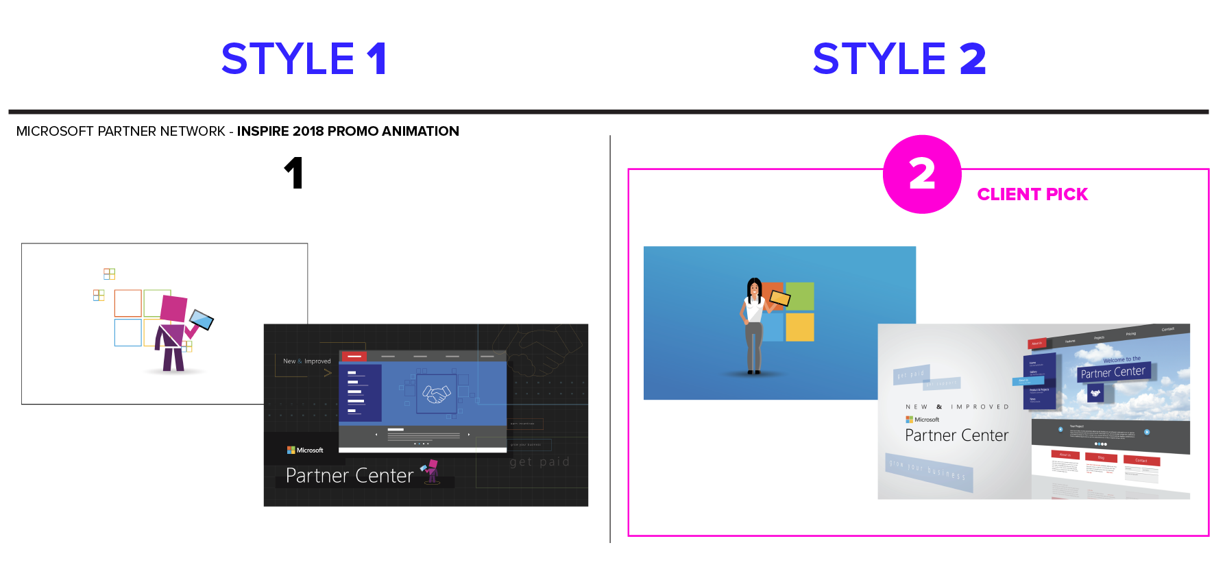
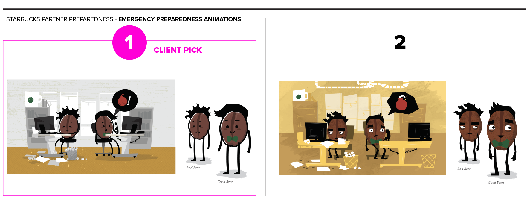
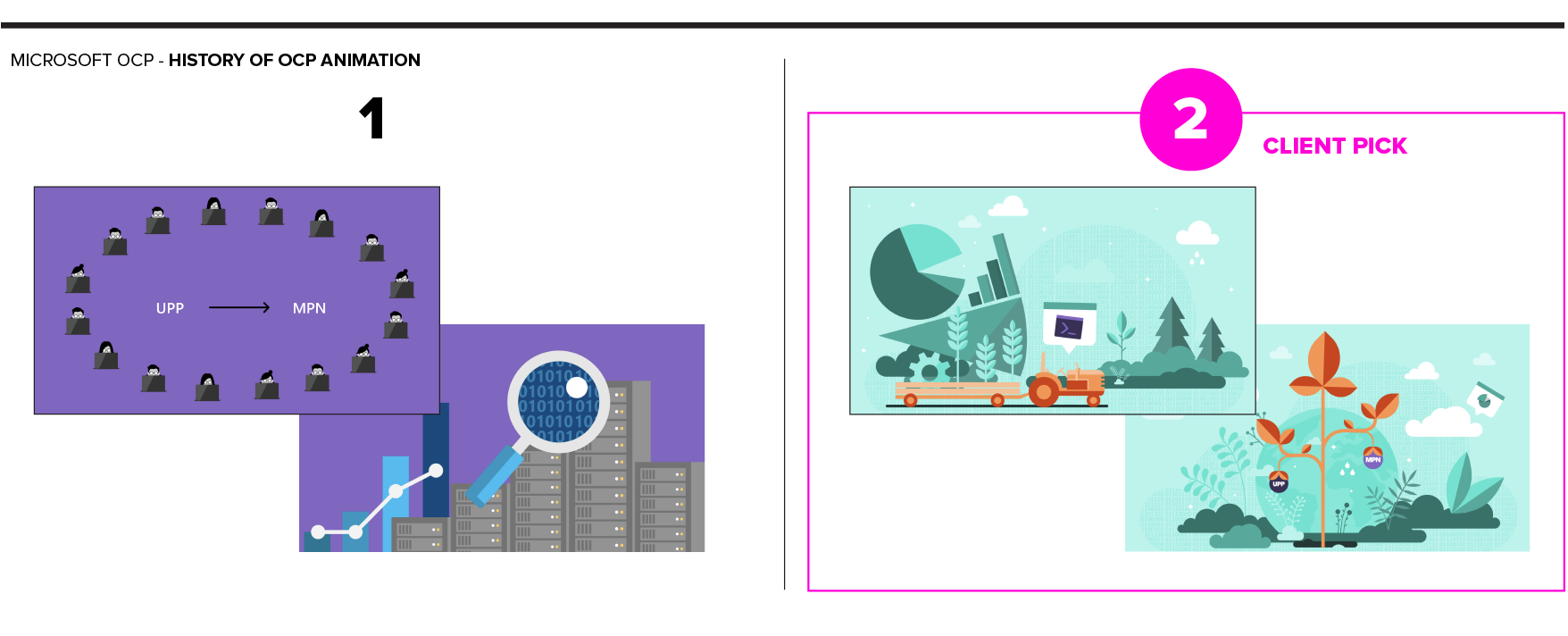
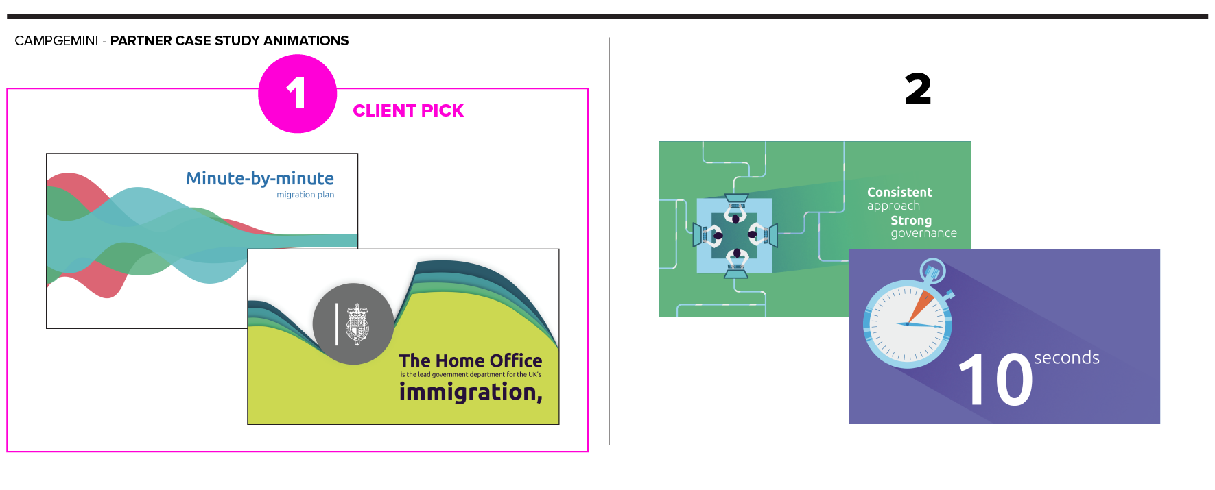
Often, the animation style is constantly evolving. While ideating and designing, new insights may appear that take the animation in a new stylistic direction that improves the visuals and storytelling.
Because of this, it is important clients are open to feedback and big changes at this stage, as well as creating more styles. Style frames are the first time clients are able to put a real face to their project and have their first reaction.
Nailing down the style frames are also important because the next step is more labor-intensive.
What Are Storyboards?
Now that we have the design style set, we’ll move into storyboarding. This phase is where the style frames and script come together; where designers and illustrators create the full animation experience with just still images.
Storyboards help plan out several key animation features:
• Scenery and background assets are fully designed.
• Characters are designed, along with their key angles, poses, actions, and facial expressions.
• Key assets, visual treatments, and typography are created.
• Approved color is applied.
• Important actions and interactions are visualized (one action can take multiple images).
• Complex transition elements are visualized.
• Framing, scaling, and angles are visualized.
This is when the client can see the full animation in a simplified comic-book-style layout. We also include detailed descriptions to help further fill in the blanks.
Depending on the complexity of the messaging or the client’s budget, we’ll start with sketch storyboards to nail down the scenes, characters, device needs, layout, and flow of the script.
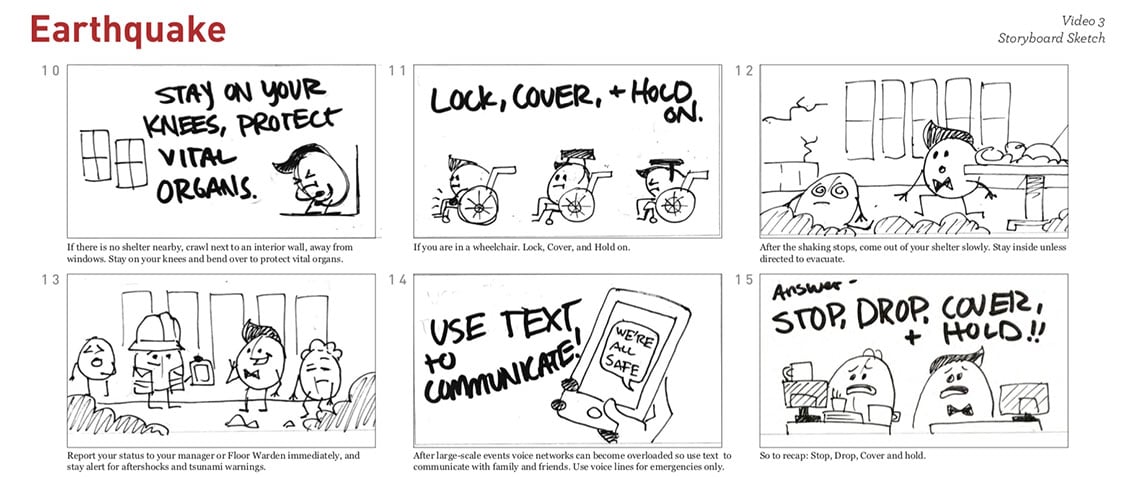
While sketch storyboards don’t utilize color, texture, or vector-based assets, they can be created much quicker and can help the client visualize the full animation in the early stages. This way, they can confirm the animation is on-track before we dive into the labor-intensive step of creating all of the final digital assets.
Next, we’ll design the assets to match the approved style frames and lay out fully-designed scenes into a digital storyboard with text descriptions.
Here are partial examples of the storyboards that were created after their styles were chosen. We expanded into more assets, scenery, color, and typography (the descriptions in these examples have been covered for privacy reasons).
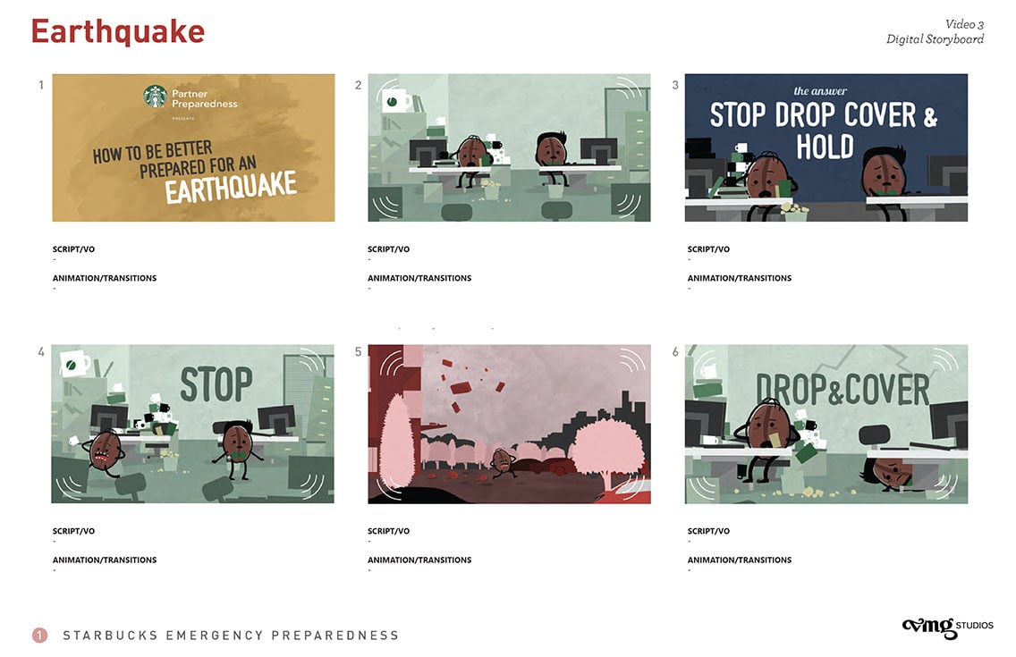
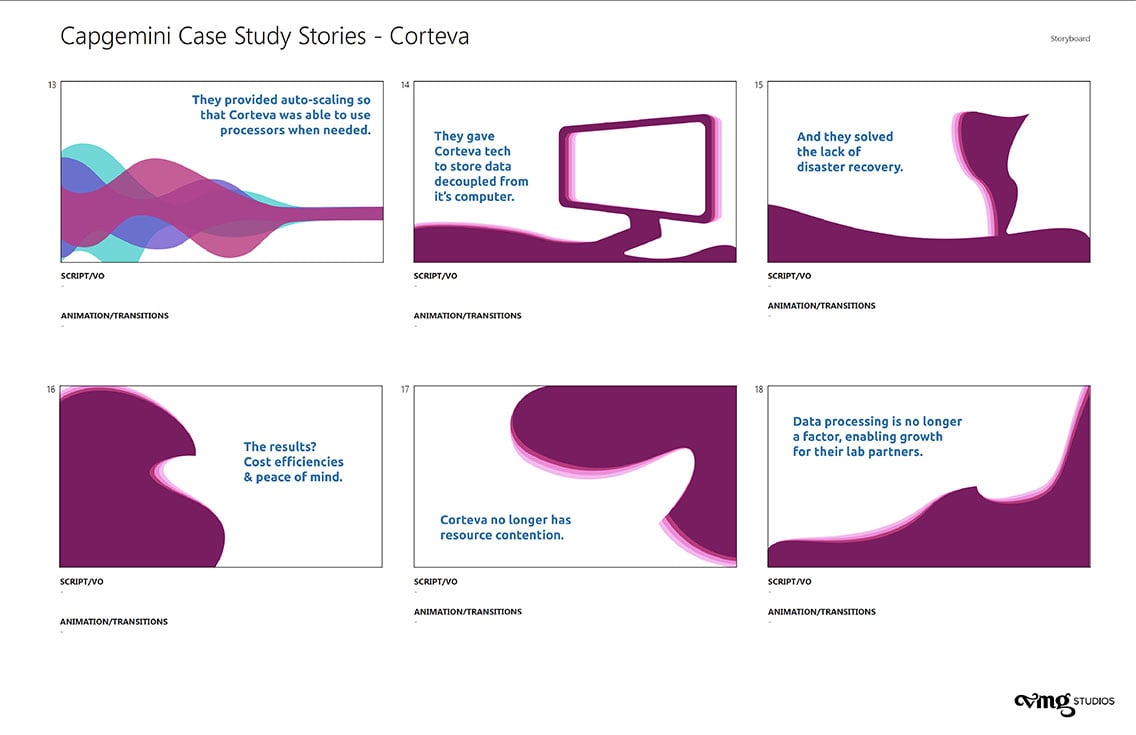
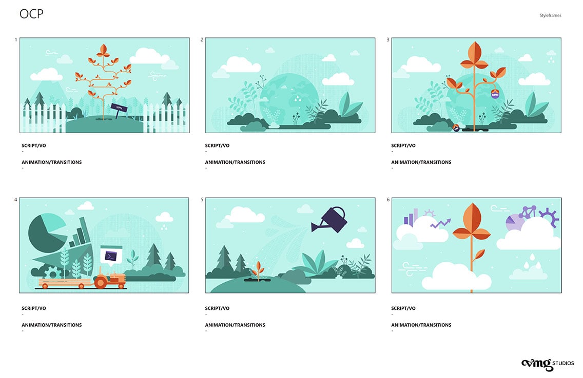
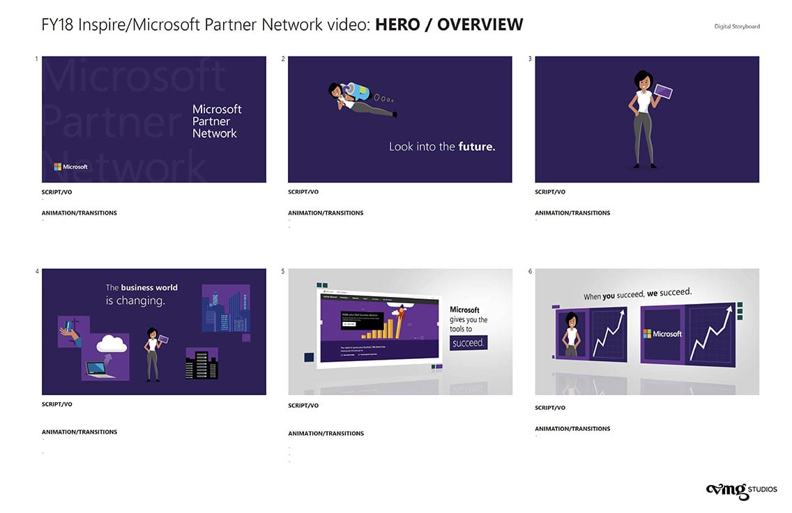
Storyboards show what the animation will look like in sequence with the script which can include a voice-over narration.
In general, storyboards go through 2 to 3 revisions based on client notes and feedback. It’s extremely important to nail down the storyboards so your animator (or animators depending on the size of the project) has a clear direction and is on the same page as the client.
Once the storyboards have been seen and approved by the client and all necessary parties, we can then begin to really bring the video to life with animation.
Understanding the Animation Process
There are plenty of statistics out there about the benefits of video marketing (heck, we have an entire article dedicated to it), and there are additional benefits of creating an animated video.
With animated videos, we can create things that are either hard to mimic in real life or don’t exist in real life, we can more easily update an animated video, and because of that, they have a longer shelf life.
Adding animation to your marketing repertoire is a solid strategy and understanding how the process works can help you better plan your next animation project from development to deployment.
Mood boards, style frames, and storyboarding helps bring a vision to life while clearly communicating the process for all of those involved. They also build upon one another and move a project along its projected timeline.
Click the image below to download the free eBook, The Marketer's Guide to Animation
